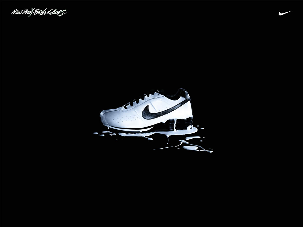
#1

On this one I added a semi-opatic gold fill over the top, with a screen blend mode. It gives the shoe more prominence, but wasn't quite there yet
#2

For this one I asked a few people if the font used for magic was appropriate and they said no, so I went online to dafont and found this nice font called Lobster, which I think works really well.
#3

In this version I changed the white gradient behind the shoe to a golden one, using a colour from the shoe as the base colour. I think that using gold as the gradient looks better than in version 1, and it also highlights the shoe's golden element. I also removed the 'NIKE' part as it is pretty obvious that it is a Nike product because of the ticks and it was proving to be excess graphics to look at.
#4

There isn't much different in this version apart from that I have added an inner shadow to the shoe. It gives it more depth and makes it look like the shadow is cast from the gradient behind it.